If you’re looking to make sense of data in a fast, efficient, and actionable way, top BI dashboards for data analysis are your ultimate solution. In today’s world, businesses generate massive amounts of data daily—from sales numbers to website traffic to customer feedback. But raw data alone isn’t helpful unless you can interpret it quickly and accurately. That’s where BI (Business Intelligence) dashboards come in.
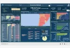
Think of BI dashboards as your “data command center.” They take scattered information from multiple sources and turn it into easy-to-read, interactive visuals. Instead of combing through endless spreadsheets or reports, you can monitor real-time metrics, track trends, and make decisions faster. Whether you’re a small business owner, an analyst, or a C-level executive, a BI dashboard can be a game-changer.
In this guide, we’ll explore the best BI dashboards for data analysis, what makes them stand out, and tips for getting the most out of them.
What is a BI Dashboard?
A Business Intelligence dashboard is essentially a tool that visualizes your business data in a way that’s interactive, intuitive, and actionable. It’s more than just charts and graphs—it’s a centralized platform that lets you:
- Monitor your KPIs (Key Performance Indicators) in real time
- Compare performance over time or across departments
- Drill down into granular data for deeper insights
- Share dashboards and insights with team members
For example, imagine you’re a sales manager. A BI dashboard can instantly show your total sales for the month, top-performing products, sales by region, and trends compared to previous months—all in one place. No need to manually pull reports or calculate percentages; the dashboard does it for you.
Key Features to Look for in Top BI Dashboards
When selecting a BI dashboard, it’s important to know which features will give you the best value. Here are the must-have elements:
- User-Friendly Interface
Dashboards should be intuitive. Drag-and-drop functionality, clear layouts, and pre-built templates make it easy for anyone to use—even without technical expertise. - Real-Time Data Updates
Outdated data can lead to bad decisions. Top dashboards update automatically, ensuring your insights are always current. - Customizable Visuals
Every business has unique metrics. The ability to customize charts, graphs, and tables ensures your dashboards reflect what matters most to you. - Integration with Multiple Data Sources
Data often comes from multiple systems—CRMs, ERP platforms, Google Analytics, Excel sheets, and cloud databases. A good dashboard can combine these sources seamlessly. - Collaboration Tools
Sharing insights with your team should be simple. Many dashboards allow exporting, sharing links, and commenting directly on reports. - Mobile Accessibility
In today’s mobile world, being able to view dashboards on your phone or tablet ensures you stay informed even on the go.
Top BI Dashboards for Data Analysis
Here’s a detailed look at some of the most widely-used BI dashboards for data analysis, what makes them stand out, and why businesses trust them:
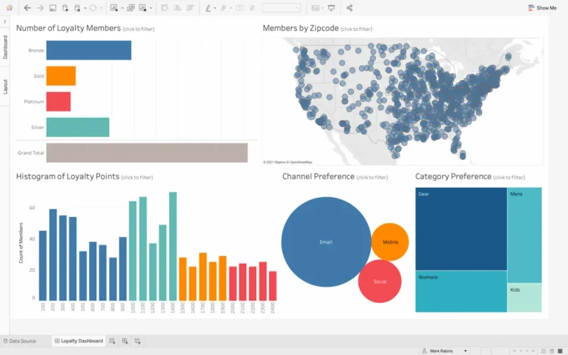
1. Tableau
Overview: Tableau is one of the most recognized BI tools in the market. It’s known for its powerful data visualization capabilities and highly interactive dashboards.
Key Features:
- Drag-and-drop interface for quick dashboard creation
- Extensive library of charts and graphs
- Advanced analytics including trend lines, forecasts, and statistical summaries
- Ability to connect to multiple data sources like SQL databases, Google Analytics, and Excel
Pros:
- Highly visual, making complex data easy to understand
- Large community support and extensive online tutorials
- Mobile-friendly dashboards for on-the-go analysis
Cons:
- Can be expensive for small businesses
- Steeper learning curve for advanced analytics
Ideal for: Data-driven organizations that rely heavily on visualization and storytelling with data.
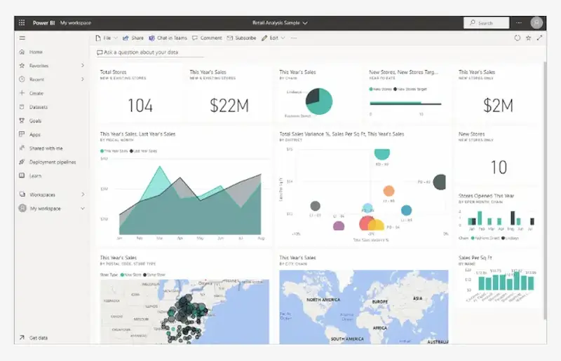
2. Power BI
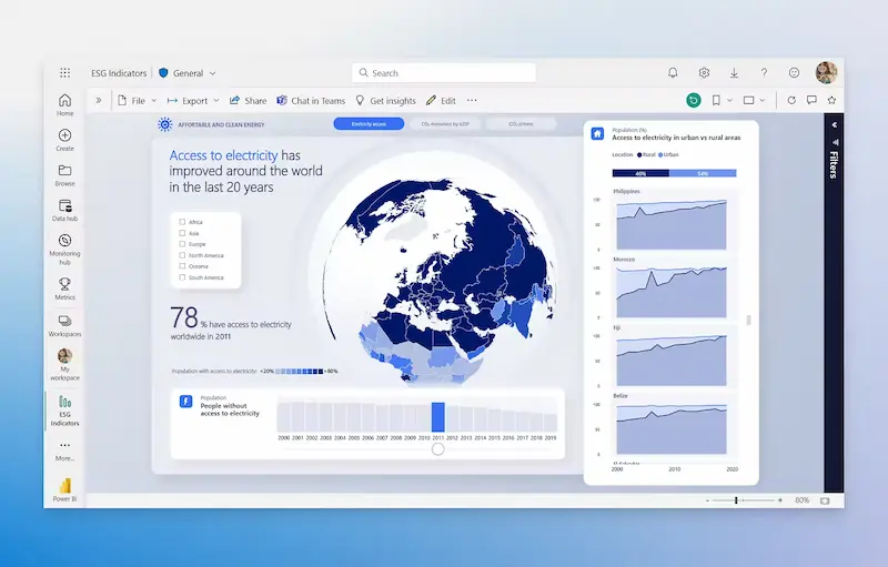
Overview: Microsoft’s Power BI is widely used for its integration with Microsoft tools and its scalability for businesses of all sizes.
Key Features:
- Seamless integration with Excel, Azure, and SharePoint
- AI-powered insights and natural language query capabilities
- Real-time dashboards for monitoring live business data
- Pre-built templates for quick reporting
Pros:
- Affordable and flexible pricing options
- Strong compatibility with Microsoft ecosystem
- Suitable for both beginners and advanced users
Cons:
- Limited customization compared to Tableau for certain advanced visualizations
Ideal for: Businesses already using Microsoft tools who want a cost-effective, easy-to-integrate BI solution.
3. Qlik Sense
Overview: Qlik Sense is a unique BI platform that emphasizes free-form data exploration. Its associative engine allows users to explore relationships in data that traditional tools might miss.
Key Features:
- Interactive dashboards with drill-down capabilities
- Strong data integration with multiple sources
- Smart visualizations that highlight trends and anomalies
- Self-service analytics for non-technical users
Pros:
- Excellent for discovering hidden insights
- Flexible and highly customizable dashboards
- Strong support for data storytelling
Cons:
- Slightly more complex setup for beginners
- Cost may be high for smaller organizations
Ideal for: Companies with complex datasets that require in-depth exploration and advanced analytics.
4. Looker
Overview: Looker, part of Google Cloud, is designed for modern data analytics with a focus on cloud integration and collaboration.
Key Features:
- Cloud-native architecture for real-time insights
- Strong SQL-based modeling for accurate data calculations
- Collaboration features to share dashboards and reports across teams
- Built-in integration with Google Analytics, BigQuery, and other cloud tools
Pros:
- Ideal for cloud-first businesses
- Easy collaboration between departments
- Scalable for organizations of any size
Cons:
- Requires some knowledge of SQL for advanced customization
- Can be expensive compared to simpler solutions
Ideal for: Tech-savvy organizations that prioritize cloud data and team collaboration.
5. Domo
Overview: Domo is a cloud-based BI tool that combines data visualization with social collaboration. Its dashboards are intuitive and designed for executives, analysts, and teams alike.
Key Features:
- Real-time KPI monitoring
- Pre-built connectors for 1,000+ data sources
- Collaboration tools such as chat, alerts, and annotations
- Mobile-first dashboards for on-the-go decision-making
Pros:
- Highly visual dashboards with easy customization
- Social features help teams collaborate on insights
- Suitable for executive-level reporting
Cons:
- Cost can be high for smaller teams
- Some users may find customization options limited compared to Tableau or Qlik
Ideal for: Companies looking for both analytics and team collaboration in a single platform.
You may also like to read this:
How AI Improves Business Operations For Smarter Efficiency
Best BI Tools For Beginners: Visualize Data Without Coding
Business Intelligence Tools Comparison: Top BI Platforms
How To Use BI Tools: Beginner’s Step-By-Step Guide
BI Reporting Tools For Business: Boost Decisions Fast
Simple Business Intelligence Software For Easy Data Analysis
Tips for Getting the Most Out of BI Dashboards
Even the best BI dashboards won’t help if you don’t use them strategically. Here’s how to maximize their value:
- Define Your Metrics – Identify which KPIs matter most to your business goals. Don’t overload your dashboard with unnecessary data.
- Simplify Visualization – Keep charts clear and easy to interpret. Highlight trends instead of cluttering dashboards with too much information.
- Update Data Regularly – Ensure your dashboards pull live or frequently updated data for accurate insights.
- Train Your Team – Everyone who uses the dashboard should understand how to interpret and interact with it.
- Use Drill-Downs – Explore deeper insights by drilling down into specific data points rather than relying only on summaries.
- Leverage Automation – Set alerts and notifications for critical metrics so you don’t miss important changes.
FAQs
Q1: Are BI dashboards suitable for small businesses?
Yes! Tools like Power BI and Tableau offer scalable solutions that can fit budgets of any size.
Q2: Can I combine multiple data sources in one dashboard?
Absolutely. Top BI dashboards allow integration with databases, spreadsheets, cloud services, and even real-time API feeds.
Q3: Do I need technical skills to use these dashboards?
Most dashboards are user-friendly, but some advanced analytics may require basic data literacy or SQL knowledge.
Q4: Which dashboard is best for mobile use?
Domo, Tableau, and Power BI offer strong mobile dashboards, allowing real-time insights anywhere.
Conclusion
Choosing the right top BI dashboards for data analysis can drastically improve how your organization interprets and acts on data. Whether you prioritize visual storytelling, cloud integration, or team collaboration, there’s a dashboard for every need. Tools like Tableau, Power BI, Qlik Sense, Looker, and Domo are trusted by businesses worldwide because they make data actionable, understandable, and engaging.
Investing time to choose the right BI dashboard, setting it up effectively, and training your team can turn raw data into a powerful decision-making tool. Start exploring these dashboards today, and watch your data transform into clear insights that drive business success.