If you’ve ever looked at a dataset and felt overwhelmed, you’re not alone. The good news is that you don’t need to be a data scientist to extract meaningful insights from data. Using simple data analysis techniques, anyone can explore, summarize, and interpret data to make informed decisions. In this detailed guide, we’ll walk you through beginner-friendly methods, practical examples, and tools you can use today.
What is Data Analysis?
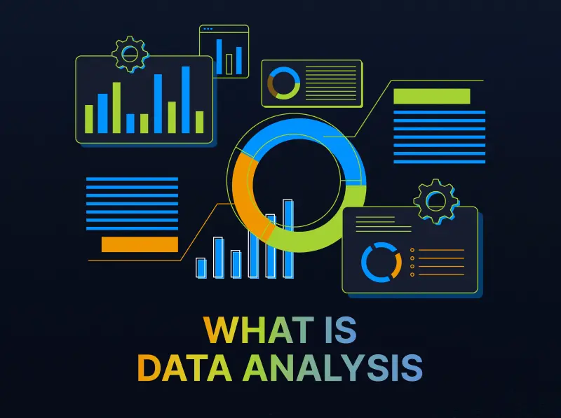
At its core, data analysis is the process of inspecting, cleaning, transforming, and interpreting data to gain insights. Think of it as turning raw numbers into understandable stories. For example, a business can analyze customer purchases to discover trends, while a student could analyze study hours and grades to find patterns in their learning.
Data analysis can seem complex at first, but starting with simple techniques makes it much more approachable.
Why Start With Simple Data Analysis Techniques?
Starting simple has several advantages:
- Easy to learn and apply: You can start analyzing data today without prior expertise.
- Quick insights: Simple methods often give you a clear view of trends and patterns.
- Build confidence: As you practice, you’ll feel more comfortable tackling bigger datasets.
- Time-saving: You can make data-driven decisions without spending hours on complex calculations.
Now, let’s dive into the most practical and easy-to-use techniques.
1. Descriptive Statistics
Descriptive statistics help summarize your data with numbers that describe its key characteristics. Here are the main techniques:
- Mean (Average): Add all numbers and divide by the total count. Example: Average monthly sales.
- Median: The middle value when data is arranged in order. Example: If 5 students scored 70, 75, 80, 85, 90, the median score is 80.
- Mode: The number that appears most frequently. Example: Most common product sold.
- Range: Difference between the highest and lowest values. Example: Range of test scores.
- Standard Deviation: Measures how spread out data is. A small standard deviation means most values are close to the average.
Why it matters: Descriptive statistics give you a quick snapshot of your dataset and help identify patterns before moving to more advanced analysis.
2. Data Visualization
Visualizing data makes it easier to spot patterns, trends, and outliers. Even beginners can create insightful visuals with simple tools.
Common visualization techniques include:
- Bar Charts: Compare categories. Example: Sales by region.
- Line Charts: Track trends over time. Example: Website traffic over months.
- Pie Charts: Show proportions. Example: Market share of different brands.
- Histograms: Show frequency distribution. Example: Number of students scoring in score ranges.
Tips for beginners:
- Always label axes clearly.
- Use colors sparingly to highlight key information.
- Keep charts simple to avoid confusion.
Visualization is not just about making your data look nice—it’s about making it understandable at a glance.
3. Filtering and Sorting
Sometimes, analyzing data is as simple as filtering and sorting:
- Sorting: Arrange your data from high to low or low to high. Example: Sort sales data to find top-selling products.
- Filtering: Focus on specific data points. Example: Filter survey responses to see only participants aged 18–25.
Most spreadsheet tools like Microsoft Excel and Google Sheets have built-in sorting and filtering options. These simple techniques can instantly reveal trends in your data without complicated formulas.
4. Trend Analysis
Trend analysis is about spotting changes over time. This helps in predicting future outcomes and planning strategies.
Examples of trends:
- Increasing customer visits during summer.
- Declining sales of a product over the last 6 months.
- Rising engagement on social media posts.
How to perform trend analysis:
- Collect data over regular intervals (days, weeks, months).
- Plot the data on a line chart.
- Look for upward, downward, or seasonal patterns.
Trend analysis is simple yet powerful, helping you make proactive, data-driven decisions.
5. Using Pivot Tables
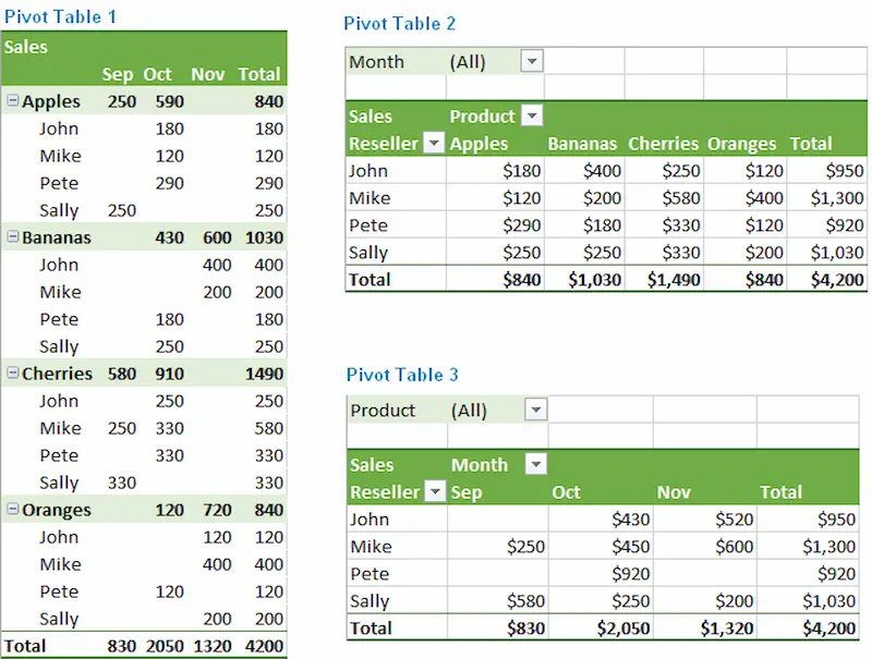
Pivot tables are beginner-friendly but extremely powerful. They allow you to summarize large datasets without writing complex formulas.
What you can do with pivot tables:
- Aggregate data by categories (sum, average, count).
- Compare data across multiple variables.
- Quickly find insights in thousands of rows of data.
Example: If you have sales data for 1000 transactions, a pivot table can instantly show total sales by region or product category.
Even beginners can create pivot tables in Excel or Google Sheets in a few clicks.
6. Basic Correlation
Correlation helps you see relationships between two variables. It answers questions like:
- Does advertising affect sales?
- Does study time influence exam performance?
How to do it simply:
- Use Excel’s CORREL() function or Google Sheets CORREL() to calculate correlation coefficients.
- A positive correlation means both variables increase together.
- A negative correlation means one increases while the other decreases.
Even simple correlation analysis can guide important decisions and strategy planning.
7. Summary Reports
After analyzing data, it’s important to communicate your findings clearly. A summary report can include:
- Key insights from data
- Trends and patterns discovered
- Simple charts to visualize the information
- Recommendations based on data
Tips for beginner-friendly reporting:
- Keep it concise and focused.
- Highlight key takeaways.
- Use visuals wherever possible.
A good summary report turns raw data into actionable insights that anyone can understand.
Tools for Simple Data Analysis
You don’t need to buy expensive software to start analyzing data. Some beginner-friendly tools include:
- Microsoft Excel / Google Sheets: Ideal for tables, charts, and pivot tables.
- Tableau Public: Great for simple data visualizations.
- Power BI: For interactive dashboards with minimal technical knowledge.
- Python (Pandas Library): If you want to explore data programmatically.
Starting with spreadsheets is enough for most beginners, and you can explore other tools as your skills grow.
You may also like to read this:
Learn Data Analytics For Beginners: Easy Tips And Tools
Complete Basic Data Analytics Tutorial To Learn Data Easily
How To Start Data Analytics | Beginner-Friendly Guide 2026
Data Analytics Tools For Beginners | Complete Guide
Practical Example: Analyzing Sales Data
Let’s say you own a small online store and have monthly sales data for the past year. Here’s how you can use simple data analysis techniques:
- Descriptive Statistics: Calculate average monthly sales, identify your highest-selling month.
- Visualization: Create a line chart of monthly sales to see seasonal trends.
- Filtering and Sorting: Filter products to see which sold most in summer.
- Pivot Table: Summarize sales by product category and region.
- Trend Analysis: Predict next quarter’s sales based on seasonal patterns.
By applying these simple techniques, you can make data-driven decisions to grow your business efficiently.
Final Thoughts
Mastering simple data analysis techniques is a valuable skill for anyone, not just data professionals. By starting with descriptive statistics, visualizations, sorting, filtering, pivot tables, and basic correlation, you can turn raw data into actionable insights.
Remember, the key is to start small, practice consistently, and gradually explore more advanced techniques as you gain confidence. Data doesn’t have to be intimidating—it can be simple, informative, and even fun to work with.
With these beginner-friendly methods, you’re ready to take your first steps in data analysis and start making smarter, informed decisions today.
FAQs on Simple Data Analysis Techniques
1. What are simple data analysis techniques?
Answer: Simple data analysis techniques are easy-to-use methods to explore, summarize, and interpret data. They include descriptive statistics (like mean, median, mode), data visualization (charts and graphs), filtering and sorting, trend analysis, pivot tables, and basic correlation. These techniques help you understand data without advanced tools or programming skills.
2. Do I need to be a data scientist to analyze data?
Answer: No! Anyone can perform data analysis using simple techniques. Even beginners can analyze small datasets using Excel, Google Sheets, or visualization tools. You don’t need advanced programming or statistics knowledge to start.
3. What is the easiest way to start analyzing data?
Answer: Begin with small datasets in Excel or Google Sheets. Use descriptive statistics to summarize data, create simple charts to visualize trends, and apply sorting/filtering to focus on specific insights. Once comfortable, you can explore pivot tables or basic correlation analysis.
4. What tools can I use for simple data analysis?
Answer: Some beginner-friendly tools include:
Excel / Google Sheets: For tables, charts, and pivot tables.
Tableau Public: For interactive data visualizations.
Power BI: For dashboards and reporting.
Python with Pandas library: For more advanced analysis as you grow your skills.
5. How can I visualize my data effectively?
Answer: Start with simple charts:
Bar charts for comparing categories.
Line charts for tracking trends over time.
Pie charts for proportions.
Histograms for frequency distribution.
Keep labels clear, use minimal colors, and focus on the story your data is telling.